Web Development Qatar
October 2018
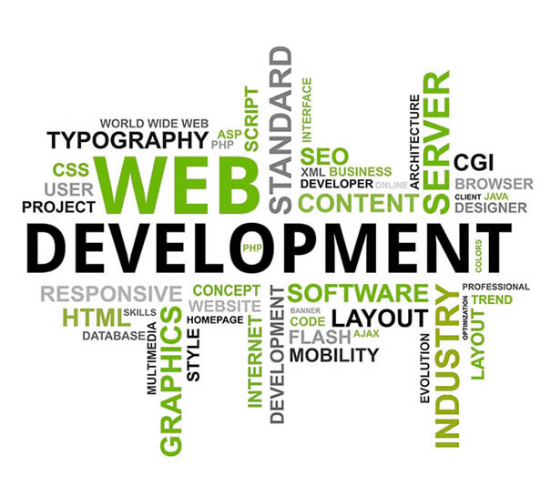
This month’s web development trends have something in common: You have probably seen all of these ideas before, maybe just presented in a slightly different way. Qatar Web Designers are returning to dark backgrounds, large headers and cards to encourage engagement, and get users interested in content on the screen.
Here’s what’s trending in design this month:
1. Dark Backgrounds on Website Designs
It seems like web designers were focusing on light, white minimal styles for a long time, but that era is starting to end. Dark backgrounds are making a comeback in a big way. Dark backgrounds provide a design opportunity quite different from white Maybe it’s the idea that cooler weather is coming. (Many of these dark backgrounds do have a cool feel.) Or maybe it’s just a shift in order to try something different. (Dark backgrounds provide a design opportunity quite different from white.)
Either way, it’s a trend that needs to stick around for a while.
Dark backgrounds can be used in so many different ways – and each presents an opportunity to create something in an entirely different way.
- Black, flat background: A simple black background creates a wide open canvas. we have used black backgrounds on some websites to set the tone for animated elements and clean white typography. It’s sharp and easy to engage with.
- Dark color overlay background: While much of this trend does focus on single color backgrounds, an image overlay is just as effective. The dark background provides an opportunity to meet the men who are the subjects of the website but with room to feature elements such as text, a logo and call to action.
2. Heavy White Headers on Websites
While some designers are going all in with dark backgrounds, there’s still a lot of white space trending. Heavy white headers are replacing all white designs though. This trend is exemplified by almost oversized headers that take up nearly half of the first screen, followed by other elements with more color, images or video. A great way to create a minimal style and use high-value imagery at the same time It’s a great way to create a minimal style and use high-value imagery at the same time. The white space does a great job of creating an easy first impression that gives room to branding and key messaging, while there’s something a little more engaging to look at beyond the initial glimpse.
This design style encourages scrolling. Most of these designs split the screen in such a way that the users sees the heavy white header and a portion of the next level of content at the same time.
Each of the examples below uses this technique in a slightly different way:
- we have used heavy white header on some websites that encompasses about two-thirds of the screen with a significant text block. What’s important to note is the use of the graphic to point users up to the information above. This key directional helps ensure that website visitors look at the headline and text first, then scroll.
3. New Application for Cards
Card-style interfaces got a lot of attention as Material Design was beginning to take off but kind of fell of the radar for a while. Cards are returning to projects again, but not in the use-them-for-the-whole-design kind of way. These cards are somewhat smaller and designed for specific interactions.What’s nice about cards is that they do a good job of directing users to do something. When designed well, a card almost demands that the user click or tap it, making them a great tool to convert CTAs or aid navigation.

